SACOMBANK repositions its brand in a new phase of development
25/12/2025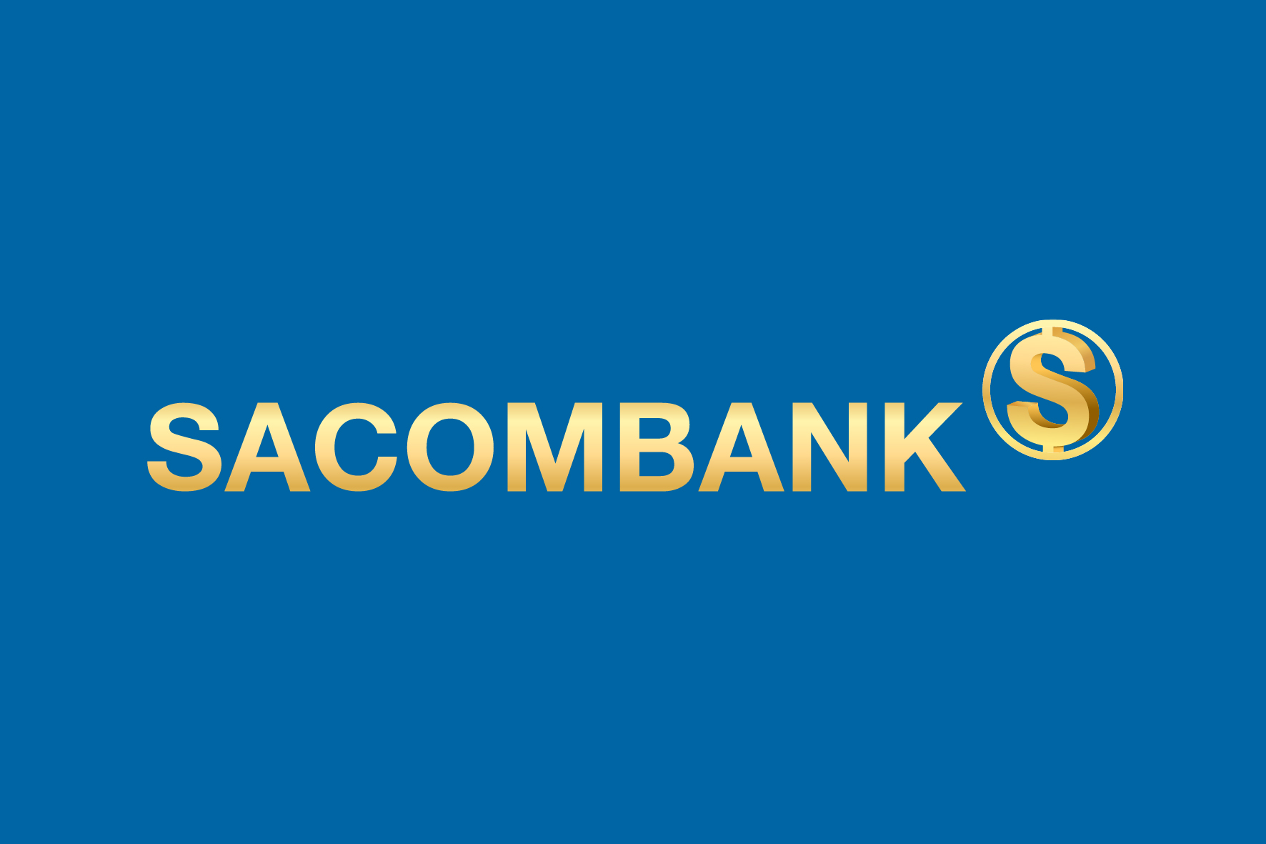
Symbol of the new development phase: Solid – Standard – Success
The new SACOMBANK logo embraces a minimalist yet decisive design. The brand name “SACOMBANK” is presented in uppercase letters with bold, balanced strokes, conveying stability and reliability. The clean, straightforward typography reflects discipline, governance standards, and operational efficiency - core values of a financial institution entering a more mature stage of development.
The stylized letter “S” – Core identity element
The focal point of the logo is the stylized letter “S” enclosed within a circular form. At its most immediate level, it represents the initial of SACOMBANK, reinforcing brand recognition built over generations. At a deeper level, the flowing stroke of the “S” evokes the universal symbol of financial flow, signifying connection, value circulation, and integration within the modern financial ecosystem.
At the same time, its soft curvature subtly recalls the S-shaped geography of Vietnam, affirming SACOMBANK’s identity as a Vietnamese bank - rooted in Vietnam and committed to the nation’s prosperity.
- S – Stability: A solid financial foundation and effective governance.
- S – Sustainability: A commitment to long-term growth, balancing the interests of the Bank, shareholders, customers, and the community.
- S – Success: The aspiration to create sustainable value for customers and shareholders.
The enclosing circle symbolizes protection, security, and integrity, while also representing continuity - a seamless financial ecosystem in which SACOMBANK serves as connector and catalyst.
Blue and Gold: The language of trust and value
The new logo features a deep blue foundation complemented by metallic gold accents - a refined evolution aligned with the Bank’s next development phase.
- Deep blue represents trust, transparency, and governance excellence - qualities increasingly valued by the market and stakeholders.
- Metallic gold symbolizes value, prosperity, and achievement, reflecting the aspiration for sustainable growth.
Together, these elements create a balanced visual identity: composed yet progressive, modern yet firmly grounded in heritage.
A mark for the journey ahead
Rather than pursuing bold or disruptive imagery, the new SACOMBANK logo expresses maturity and resilience. It reflects a bank that has navigated multiple cycles and understands that enduring value is built upon strong foundations, disciplined governance, and long-term vision - not merely rapid expansion.
More than a visual transformation, the new logo represents a brand declaration: SACOMBANK is entering a phase of deeper development, prioritizing governance standards, operational excellence, and long-term responsibility toward customers, shareholders, and society.
In this new phase, the SACOMBANK logo will be consistently applied across all touchpoints - from physical transaction spaces to digital platforms and community initiatives - serving as a symbol of trust and enduring partnership.
Each appearance of the logo is not simply a mark of recognition, but a reaffirmation of a renewed SACOMBANK: resilient in value creation and steadfast in contributing to the long-term prosperity of its customers and the nation.